I’d like to start this post off by saying how grateful I am to be included in the Warlords of Draenor Friends and Family Alpha. It’s no doubt due to my affiliation with SentryTotem.com and I’d just like to say that being the Guild Leadership columnist over there for the last couple of months has been a great experience. I love writing about guilds and leadership and problems that you might face and that’s now brought me into the Alpha. So thank you to Tickle for all her hard work in getting Sentry Totem up and running and thank you to Blizzard for allowing me the opportunity to play around in Warlords of Draenor.
Okay, having said that, let’s talk about the content.
WHAT DO YOU MEAN, I CAN ONLY PLAY HORDE?
I tried to copy my hunter, Kurn, to Lost Isles (PVE/US). Unfortunately, character copies to Lost Isles are disabled or something. And character creation on Lost Isles is disabled — for the Alliance. I’m not actually angry or anything about this, because the fact of the matter is, this is an Alpha build and they want to test out certain things. So right now, they want to test out the introductory Horde experience.
This is the longest I have ever spent playing a Horde character pretty much ever. I am an Alliance supporter through and through (despite the fact I pretty much can’t stand Varian), so this is completely weird to me.
I created a pre-made hunter since I figured I’d spend most of my time questing and killing things, rather than healing as a holy paladin, but I do plan to explore holy paladins too.
Oh, and before I go on, screenshots are busted in that the default .JPG format isn’t working. If you’re in the alpha and your screenshots aren’t working, do:
/console screenshotFormat tga
Warning: each screenshot will be several megabytes. Thanks to Kodiack on the alpha forums for the tip and thanks to Crow (@unlimitedBLACK on Twitter) for pointing me that way. I highly recommend IrfanView to open and convert the .tga files to .jpg.
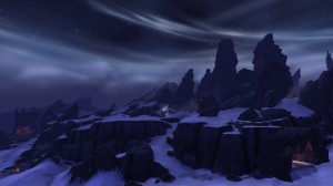
Still, let me tell you, it’s worth taking screenshots. Some of the stuff I’ve seen is just beautiful.
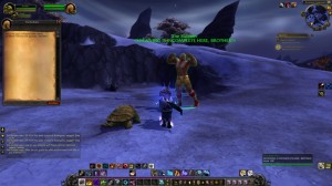
And some of it is just hilarious.
Anyhow, I made myself a pre-made goblin hunter because, well, goblins are fun-looking and suit me a lot better than orcs, trolls, undead or tauren. Or blood elves. Or pandas. Yeah, so I went goblin.
You get a crapton of mounts on a premade, plus the Camel-Hoarder title, 10k gold and… oh man, my addons. I miss my addons. It took me forever to set up my bars and they are SO not well-organized, but more or less reflect how my live keybinds are. Sort of.
So far, in terms of story and such, I’ve built my garrison, have barracks and a follower (actually, come to think of it, I have a “contract” for someone else, so I imagine that’s a second follower) and that was… interesting? I mean, it wasn’t boring, but it wasn’t terribly exciting. Not yet, anyhow. We’ll see how that goes. Meanwhile, I know that the Godmother is ALL ABOUT GARRISONS, so here, have a link to her garrison stuff.
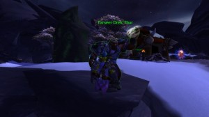
I’ve also spent a fair amount of time running around with Thrall and Durotan and hey, look, it’s freaking Drek’Thar:
USER INTERFACE CHANGES
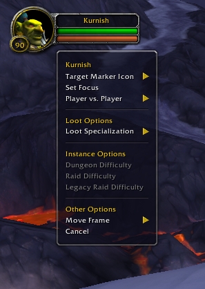
So here’s what right-clicking on a unit frame will now do. I think this makes life a lot easier for people. Everything is right there for you to change stuff and it’s nicely broken down, IMHO.
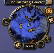
The minimap has changed a bit, too:
Those yellow dots are actually what I’m searching for in my currently selected quest. You can see the blue area of where they’re supposed to be located, but now I can just see where the things I’m looking for are actually located. This is helpful in a few different cases, but, well, this is probably where my Vanilla-self comes out and goes “is that really necessary? I already know in which area to look, why do I need them marked off for me?” I can see that a newer player would be pleased to have that, but for me, it means I really don’t have to read quests…
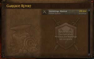
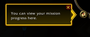
The little scroll thing to the left of the clock is basically the progress of your garrison’s missions.
And here’s what your mission progress looks like:
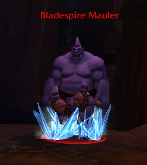
There are also now these weird outlines around various mobs when you hover over them.
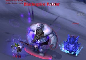
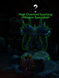
And blue outlines for non-flagged friendlies, I gather. Basically, it’s just another way to express the statuses of various mobs, as if the text colour of their names/affiliations isn’t enough. I’m not really a fan, but again, this probably lessens the learning curve for a newer player. For me, though, it’s just distracting.
Oh, check out the stuff in my bag:
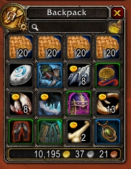 So that’s a row of food they provided, and my Hearthstone, but it took me a while to understand what the hell these little yellow ovals were on some of these icons. And then it dawned on me — they’re all grey. Thus, vendor loot. Thus, gold icons on them to show “hey, you get gold for this!”
You can also see some green and blue outlines if you look carefully. Those indicate, at a glance, the rarity of the item.
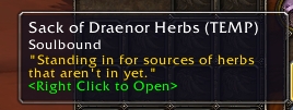
Oh, and currently, some gathering nodes are in, but sometimes you’ll just randomly get a sack of ore or sack of herbs to make up for sources that aren’t in yet.
HUNTER STUFFZ
There is a new visual for the Freezing Trap. Instead of being in an ice cube, mobs are trapped in spikes of ice.
On the one hand, I liked the ice cube. On the other, targetting was always a little wonky with those in the way. While I worked out how NOT to accidentally target my trapped mobs, sometimes I had to move my camera A LOT to target a different mob.
I’m currently Survival, by the way. Not having Serpent Sting as something to push is so foreign, but it’s wrapped up in Arcane Shot. Not having Kill Shot is also strange. I may play around with Marks a bit later, because I am, at my heart, a Marks hunter.
Misdirection is somewhat broken at the moment, which I knew from keeping up on hunters at Bendak‘s awesome site, Eyes of the Beast and through his Twitter. Basically, they were going to have Misdirection persist for like, an hour. So because of that, they removed the Glyph of Misdirection that allows you to essentially chain-cast MD on your pet. But then they reverted the Misdirection for an hour change and, well, MD is kind of useless on my pet, only being able to cast it once per 30 seconds. So I’m hardly using it, although I really ought to macro it to something.
I also dinged 91 and got my first Draenor perk: Improved Camouflage. (I’m a bad hunter because I never use Camo, right?)
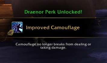
Also, Survival has a neat passive called Survivalist, which heals you (over 10s) for 15% of your total health after you kill a mob (presumably one that is worth honor or experience), which is nice.
One thing that’s bugging me is the lack of Aspect of the Hawk — but not for the reasons you may think. It’s because with Aspect of the Hawk, I had a reminder to turn off Aspect of the Cheetah. Also, it would automatically turn off Cheetah when I hit Hawk. I’m thinking I may just glyph Cheetah so I’m no longer dazed and it cancels the aspect when I’m hit. After years and years and years of training myself to hit Aspect of the Hawk to turn off Cheetah/Pack, I’m finding it difficult to remember to right-click it off, or hit the button again.
STAT SQUISH
Love it. Love everything being a couple of magnitudes lower than on live. It feels comfortable to look at a number like “1412” instead of “141,200”. I feel as though I can understand the smaller number a lot better.
I also picked up a couple of upgrades, like these legs: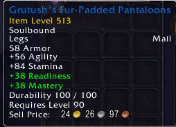
And those numbers, 56 agility, 84 stamina, etc? Those look a lot better to me than the crazy numbers we have on live. I have 1634 agility on my legs on live. I’ll stick with double (mayyyyyyybe triple) digits over four digits any day. I wasn’t ever worried about the stat squish, but I am 100% on board with it. These are very similar numbers to what we saw on low-level blues in Wrath of the Lich King, like on stuff out of normal Violet Hold. (Seriously, look at the Tattooed Deerskin Leggings to compare.)
Anyhow, that’s about it for now. Anything you’re curious about? Let me know. I won’t really be able to stream (my upload rate is pathetic and resulted in a very poor streaming experience when I played around with it today), but I CAN do screenshots and talk about stuff!
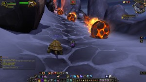
And now, I leave you with this screenshot, without any context whatsoever. ;)
I think Improved Camouflage just catapulted Hunters past Rogues and Kitty Druids into the stealthie of choice.
This does not bode well for Rogues, who are already at the bottom of the barrel in player representation.
Freezing Trap looks awesome. I am not even going to admit how many times I’ve gotten confused in BGs because I wasn’t sure if someone was trapped, or a mage was using Ice Block.